Let’s rewind on my previous posts on the most startling figure that shows the health catastrophe caused by the experimental COVID-19 shots.
Months ago, it was clear U.S. all-cause excess deaths in 2021 were outpacing 2020.
U.S. All-Cause Excess Deaths Are Through the Roof! 2021 Is On Pace to Eclipse 2020
2020 – No experimental shots
2021 – Mass rollout of experimental shots
Former Blackrock Portfolio Manager Edward Dowd recently stated, “the millennial age group 25 to 44 experienced an 84% increase in excess mortality into the fall. It’s the worst ever excess mortality, I think, in history.”
Putting the CDC’s data into perspective: “starting in the summer and into the fall, with the mandates and the boosters, there were 61,000 excess millennial deaths,” said Dowd.
“Basically, millennials experienced a Vietnam War in the second half of 2021.”
The dramatic rise in all-cause excess deaths isn’t exclusive to the United States.
It’s a catastrophe that’s decimating countries with high COVID-19 inoculation rates.
Last night, I discovered a Twitter page that created visual displays that clearly illustrate the correlation between COVID-19 injections and excess deaths.
The videos use statistics pulled from Our World in Data.
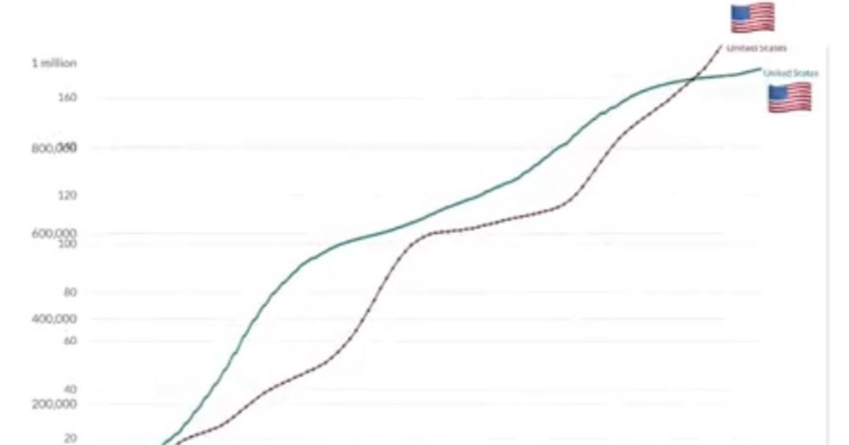
United States
United States 🇺🇸
Source: Our World In Data pic.twitter.com/E2KCE9Si3o— TexasLindsay™ (@TexasLindsay_) April 25, 2022
Israel
🇮🇱 Israel 🇮🇱
Source: Our World In Data
Music Requested By: @Jikkyleaks pic.twitter.com/mUdHvMPTxQ— TexasLindsay™ (@TexasLindsay_) April 26, 2022
Greece
🇬🇷Greece🇬🇷
Source: Our World In Data pic.twitter.com/jAH7d13cp6— TexasLindsay™ (@TexasLindsay_) April 26, 2022
Malaysia
🇲🇾 Maylasia 🇲🇾
Source: Our World In Data pic.twitter.com/QFb0xZBbQ6— TexasLindsay™ (@TexasLindsay_) April 27, 2022
Now, let’s compare countries based on their COVID-19 inoculation rates.
These clips analyze vaccination status and COVID-19 deaths.
Canada-Afghanistan
Similar Population Sizes, Different Outcome in Data:
Covid Deaths + Vaccination Status
—Canada 🇨🇦 (pop. ~ 38 million)
—Afghanistan 🇦🇫 (pop. ~39 million) pic.twitter.com/ksmFXr89kh— TexasLindsay™ (@TexasLindsay_) April 23, 2022
Israel-Papua New Guinea
Data: Covid Deaths + Vaccination
Israel vs. Papua New Guinea
Population ~ 9 Million (each)
———————
Source: Our World In Data
———————
Requested By: @Jikkyleaks pic.twitter.com/Vfl1KwvbgM— TexasLindsay™ (@TexasLindsay_) April 23, 2022
United Kingdom-Democratic Republic of Congo-Tanzania
Covid Deaths + Vaccination Data Comparison:
—United Kingdom (pop. ~68M)
—Democratic Rep. of Congo (pop. ~92M)
—Tanzania (pop. ~62M)Source: Our World In Data pic.twitter.com/Xs54Ajibdh
— TexasLindsay™ (@TexasLindsay_) April 23, 2022
Australia-Niger
WATCH: Australia vs. Niger
Both Approx. 25 Million Population
Comparison: Covid Deaths + 💉Status pic.twitter.com/JFjmTFOdFR— TexasLindsay™ (@TexasLindsay_) April 23, 2022
United States-Countries with Fewer Than 15% Vaccinated
WATCH: Covid Country Comparison
USA >77% 💉 vs Countries <15%💉Source: Our World In Data pic.twitter.com/OQTLoB3PqR
— TexasLindsay™ (@TexasLindsay_) April 22, 2022
Continent Comparison
Covid Deaths vs. Vaccination Status
🌍 Comparison of:
—Africa (Pop. ~1.37 Billion)
—Europe (Pop. ~748 Million)
—S. America (Pop. ~434 Million)
—N. America (Pop. ~596 Million)Source: Our World In Data pic.twitter.com/srGwEkGKLF
— TexasLindsay™ (@TexasLindsay_) April 23, 2022
Global Population High Income-Low Income
———————————————
———————————————GLOBAL—High vs. Low Income:
Covid-19 Deaths + VaccinationsSource: Our World In Data
———————————————
——————————————— pic.twitter.com/eMdBJ0B2XG— TexasLindsay™ (@TexasLindsay_) April 23, 2022
It couldn’t be presented any clearer than these visual graphics created by @TexasLindsay.

Join the conversation!
Please share your thoughts about this article below. We value your opinions, and would love to see you add to the discussion!