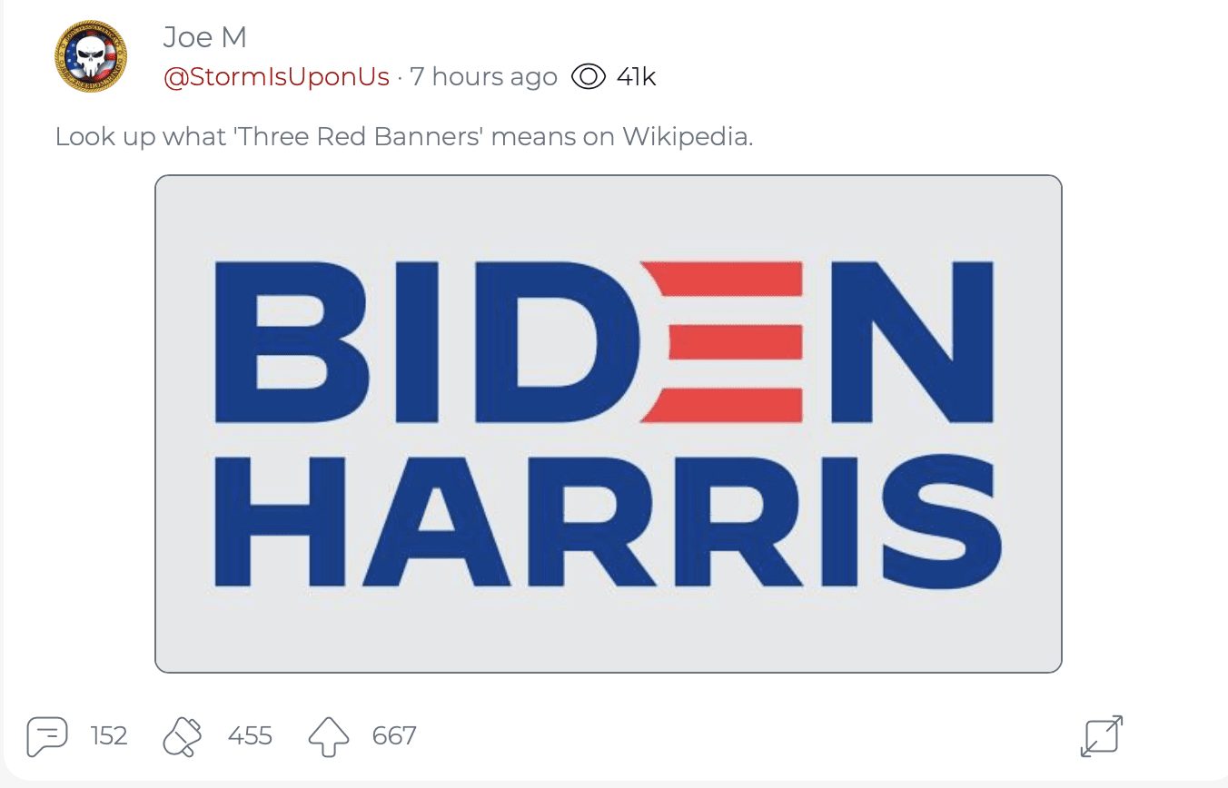
Well, you can mark this down.
This is the first and ONLY time you'll ever see a BIDEN HARRIS logo on this website.
And I think they're all about to disappear very soon when they get spanked at the polls!
Soon to be gone like a bad fart in the wind.
But for right now I needed it as a visual.
I saw this today from Joe M on Parler, and he asked a simple question:

So I looked it up.
And the answer should shock the conscience of all Americans.
How did we ever get to this point?
From Wikipedia (you can verify for yourself) three red banners means SOCIALISM.
Yes folks, the Biden campaign is officially promoting socialism, not even trying to deny it anymore.
From Wikipedia:
Three Red Banners (Chinese: 三面红旗) was an ideological slogan in the late 1950s which called on the Chinese people to build a socialist state. The "Three Red Banners" also called the "Three Red Flags," consisted of the General Line for socialist construction, the Great Leap Forward and the people's communes.[1][2][3]
After the first Five-Year Plan, the People's Republic of China continued its socialist construction by introducing "Three Red Banners Movement". The General Line directed the Chinese people to "go all out, aim high, and build socialism with greater, faster, better, and more economical results."[2] By the end of 1958, nearly all Chinese peasants had been organized into communes averaging 5000 households each. All privately owned property was taken for or contributed to the communes and people were not allowed to cook their own food and instead ate in communal dining halls. The Great Leap Forward, begun in 1958, was a campaign to rapidly modernize by using China's vast labor resources in agricultural and industrial projects. The Leap instead resulted in economic destruction and tens of millions of famine deaths, and had been mostly abandoned by early 1962. Membership in communes was gradually reduced in the early 1960s, with some private property ownership and enterprise again being allowed. The communes continued until being dismantled in the early 1980s under Deng Xiaoping.
Turns out almost no one likes his logo anyway:
And from CreativeBloq:
Last month saw former vice president of the United States Joe Biden throw his hat into the ring as a candidate for the 2020 presidential race. Announced with a sobering video and a new website, Biden's campaign features a logo that has attracted the wrath of online design critics.
What does and doesn't make for a good logo can be a heated topic at the best of times, but chuck politics into the mix and it looks like you've got a match made in hell. We've already covered everything you need to know about good logo design, so let's take a look at how the Biden campaign measures up.
The campaign includes two logos, a circular version and another one that confidently stacks the word 'Biden' on top of 'president'. Each is suitably decked out with the familiar red, white and blue of the Star-Spangled Banner, and they firmly establish Biden as the front runner of the Democrats.
The most notable element of the logo though is that the 'e' in Biden strays away from the rest of the sans-serif lettering. Instead, it's depicted with red flag stripes. Why is this notable? Well, it depends on who you ask. We're going to remain as politically neutral as possible here, but it's impossible to discuss the kickback to these logo without addressing Biden's behaviour.
Of course Biden is closely linked to Obama, having served under him during his time as president. However maybe it would've been a good idea for Biden's campaign to set him apart from Obama, rather than appearing to rely on a connection to what's gone before.
Other complaints focus on the shape of the lettering and the spacing between the red stripes. According to critics, these have been laid out in a haphazard manner, with the slant on the letter 'J' not running parallel with the slope on the number 2.
A misalignment of the logo elements is also being blamed for why viewers might be finding the design difficult to look at without knowing exactly why. This gripe reminds us of the diagram Riot Games released to justify their new logo. We'd forgive you for writing off these complaints as logo design pseudoscience, because functional and well designed logos don't have to line up neatly to work.
There's no shying away from the major flaw some people have found though, and it all comes back to those red stripes. According to critics, these conjure up the image of a red hand. This is also an open goal for Biden's opposition to remind everyone of his harassment allegations, especially as they claim that the kerning looks like the letter 'e' getting a little too up-close-and-personal with the letter 'n'.
Of course, reading into the logos of politicians is nothing new. Cast your mind back to the 2016 presidential race, and similar attacks we're being launched at Clinton's logo. At the time her opponents were claiming that it was stolen from WikiLeaks and that it contained hidden meanings.


Join the conversation!
Please share your thoughts about this article below. We value your opinions, and would love to see you add to the discussion!